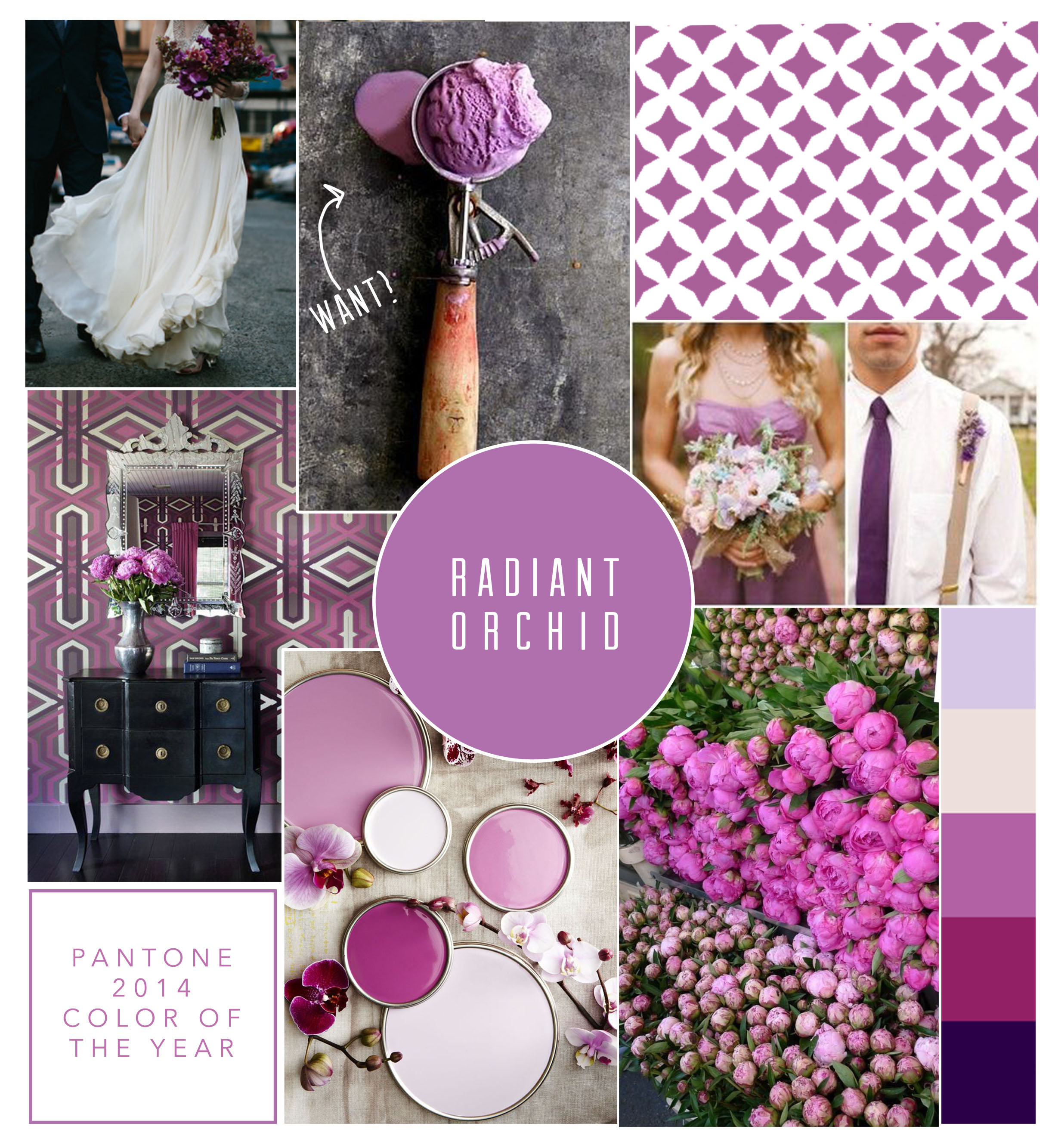
 Last week, Pantone announced their pick for the 2014 color of the year. It has has received a lot of mixed reviews, but in all honesty, I really kinda like it. Pantone describes it as " an expressive, creative and embracing purple—one that draws you in with its beguiling charm. A captivating harmony of fuchsia, purple and pink undertones." I think they are encouraging the use of more than just one color, and instead guiding towards a general palette to follow. My home office proudly sports an orchid on the desk near the window. It is resilient and lovely. A good reminder for when I am working into the wee hours of the night!
If nothing else, it makes for great mood boarding. I don't think I have ever had more fun making one! ;)
