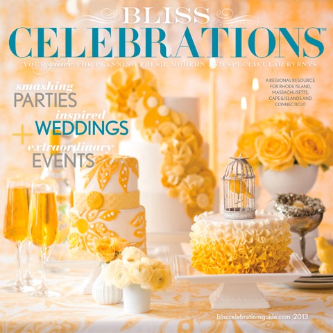
If you caught our post the other week about Bliss Celebrations Guide's color crushing, we're extra excited to share a "part 2" for the post. Within the beautiful pages of this magazine, are a few inspiration shoots that we had the joy of participating in! From Rustic Audubon to Vintage 1920's, get a load of these fun stationery suites that we designed!!
Featured: Bliss Celebrations
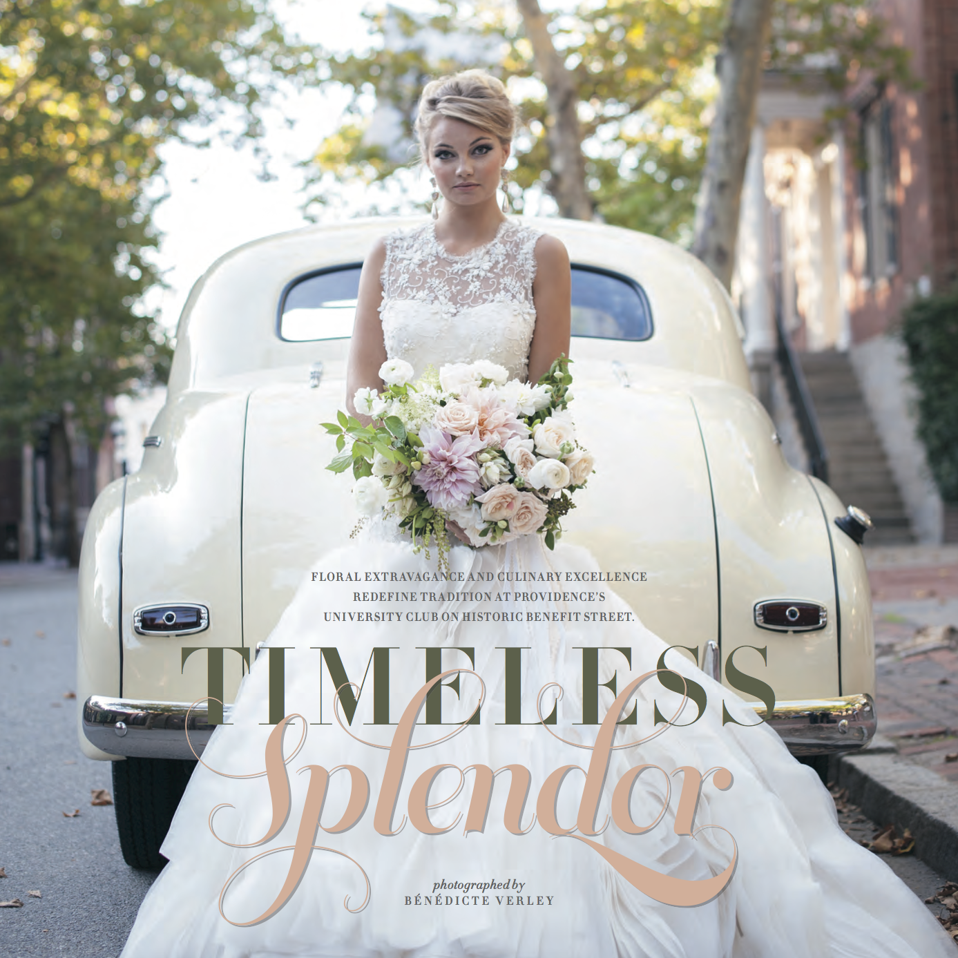
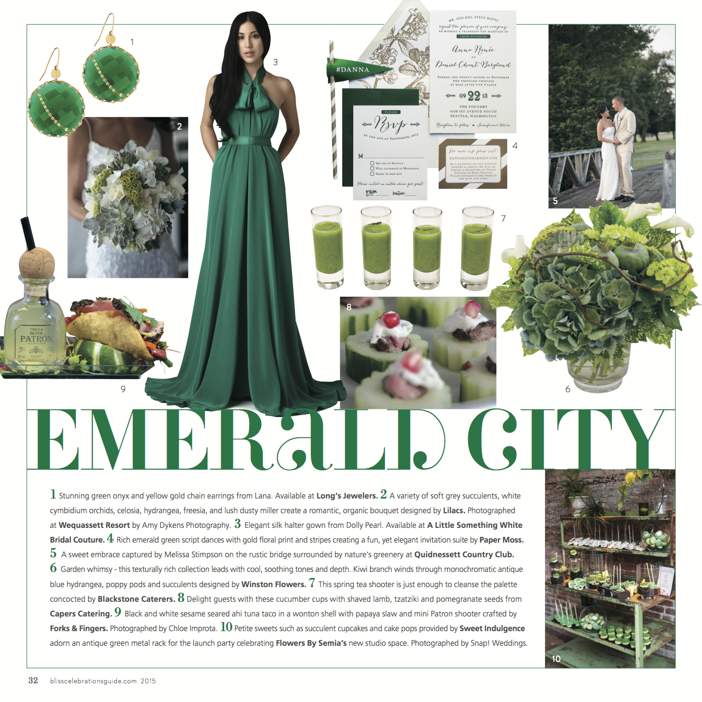
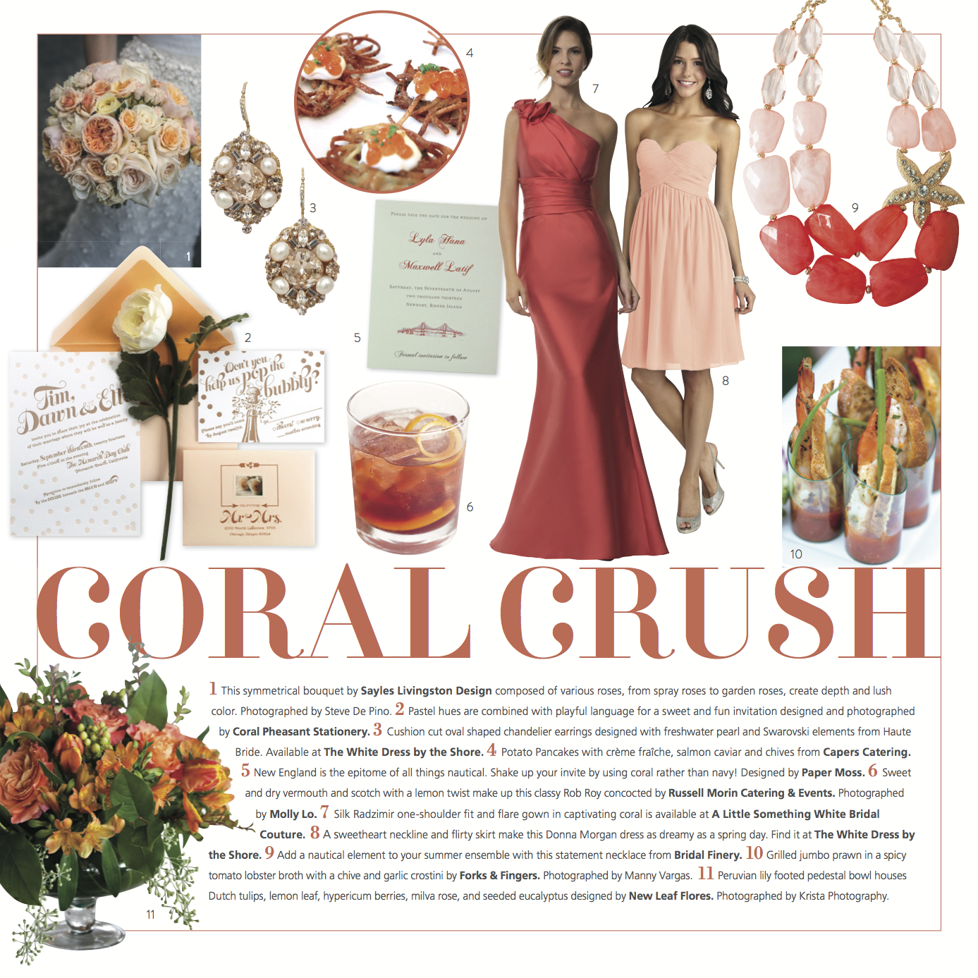
A couple of weeks ago, we donned our fanciest winter ensembles and headed over to the annual release party for the Bliss Celebrations Guide! As per usual, the event was over the top and impressive in every way. A perfect way to set the tone for their killer 2015 issue!! Along with some stunning real weddings and inspiration shoots galore, there was plenty of color crushing throughout the pages. Take a peek at some of the color trends for 2015... and some of our pretty stationery that was featured!!!
#9, Pia & Rob's marsala & gold wedding invitation.
#3, Sarah & Devin's art deco inspired invitation suite.
#4, Anna & Dan's rustic & modern invitation suite.
#5, Lyla & Max's Newport Bridge save the date.
#3, Kim & Dan's elegant black & white invitation suite.
Needless to say, we're pumped about these beautiful features!
Pure Bliss
Just the other week the ladies of Paper Moss had the chance to get fancy and celebrate the release of the latest issue of Bliss Celebrations Magazine. Do they EVER know how to throw a release party! Take a peek at some of the pretty pages… and definitely peruse the whole issue {here} when you have time!
Gold is our favorite neutral color right now… and it's a perfect compliment to nearly every palette! We topped off Lyla & Max's soft gold letterpress suite {shown below} with tangerine painted edges for a sassy pop of color!
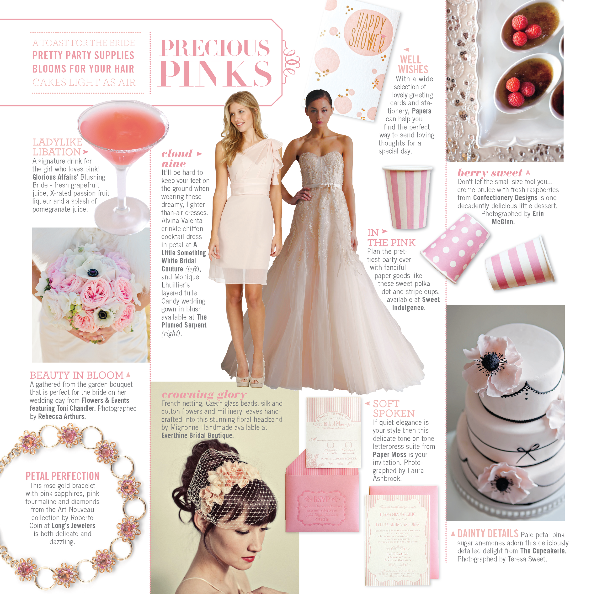
A pretty pink palette can create an ambience ranging from romantic to fun. Tyler & Tijana's tone-on-tone letterpress suite was inspired by Chanel and we combined both stripes, floral and unique frames to keep the eye moving throughout the suite.
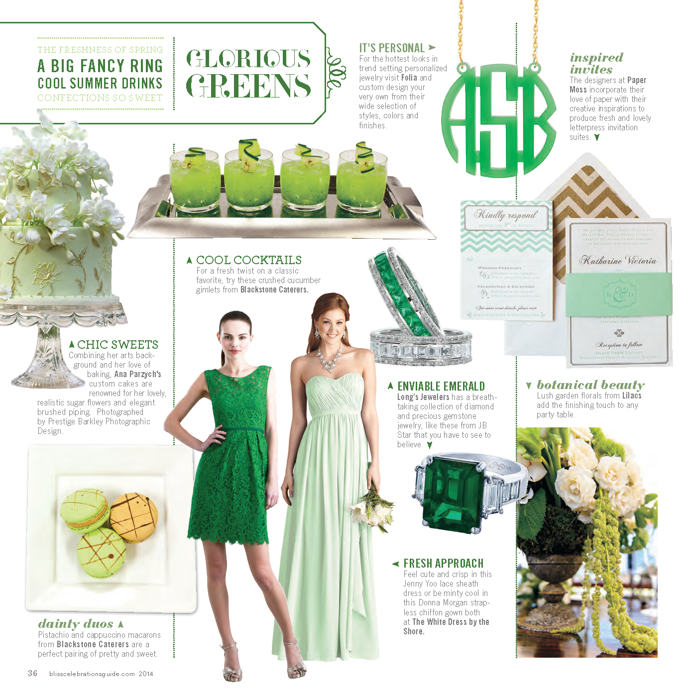
From mint to emerald, we've had some fabulous green invitation suites these past few months! Katharine & Daniel's mint & gold letterpress invitation suite features playful chevron, cute icons and a fun monogram which was carried throughout their day of materials!
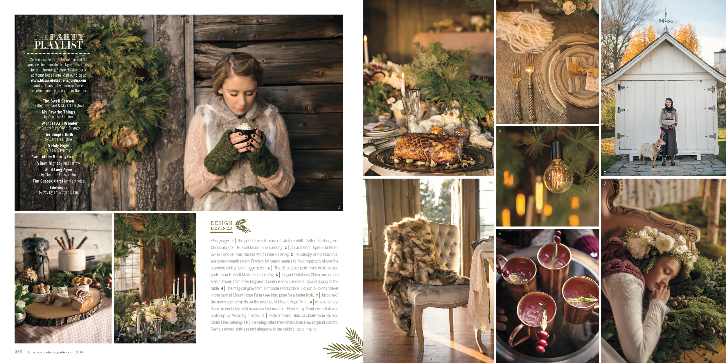
As if those color round ups aren't enough inspiration, we collaborated with Bliss Celebrations on this gorgeous, rustic Alpine Woods inspiration shoot! Though we're heading into spring at this point, the rich colors and cozy textures have our minds already spinning with ideas for next winter and fall!
The latest from Bliss Celebrations!
We recently had the opportunity to welcome the arrival of the latest issue of Bliss Celebrations Magazine at the Providence Public Library. It was such a beautiful night and a perfect way to celebrate some of the hottest trends in weddings & events. We couldn't resist sharing some of our favorite clips from this gorgeous magazine... but please, flip through the magazine and see for yourself how stunning it is!
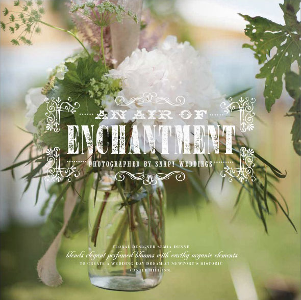
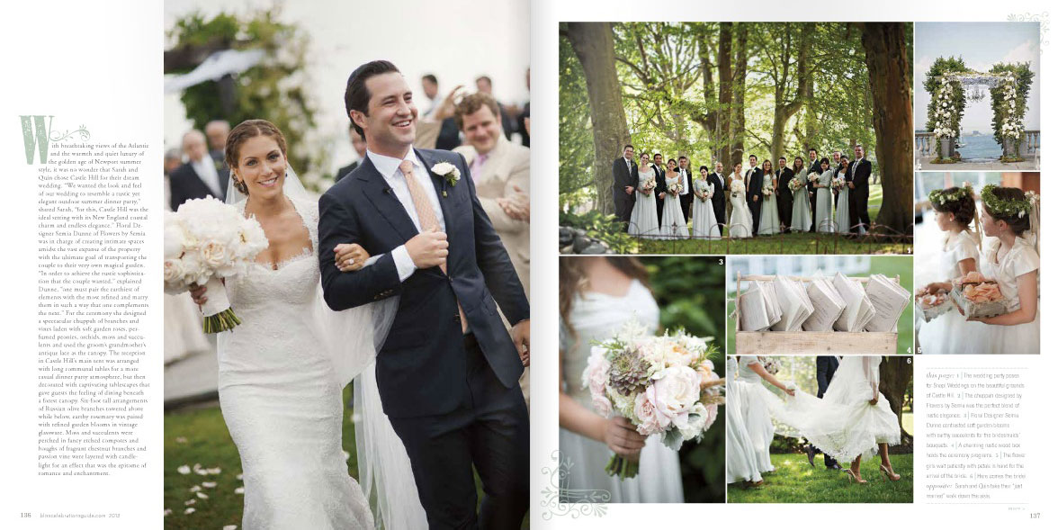
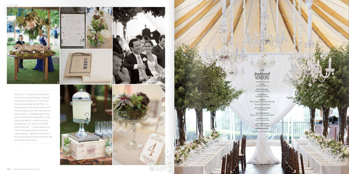
We loved this beautiful feature of Sarah & Quin's wedding at Castle Hill. All of these fresh, romantic details were perfectly captured by Snap! Photography and we are honored to have been able to design some of their stationery items, including their letterpress invitation that was sent in a box of lavender.
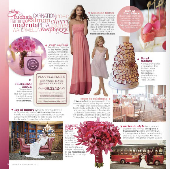
...and Shannon & Brett's letterpress coaster Save the Date fits perfectly with this monochromatic round up.
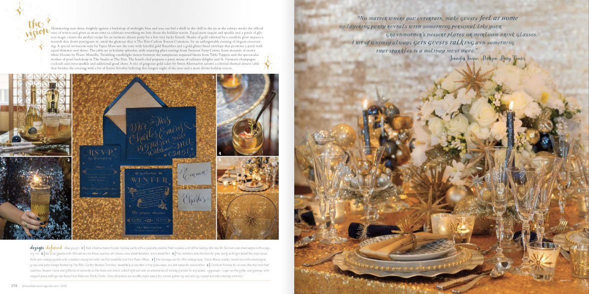
Last, we had so much fun designing this shimmery invitation for a chic holiday get together! Agh, all of this sparkly inspiration is just making us think of more ways to incorporate more shine into every day.
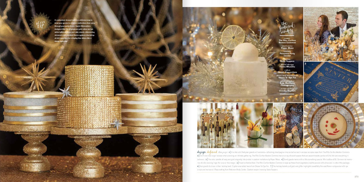
Thanks for celebrating some of our recent press with us!! We couldn't possibly be more excited!
A Blissful Celebration
Happy Monday! Today is a day to celebrate. Why? Well, aside from the start of a soon to be fabulous week {trust us, this is going to be one amazing week} we're super excited to share some fun features that were in the most recent issue of Bliss Celebrations magazine! We at Paper Moss just adore this mag and if you've had your hands on a copy you'll know why. Each page is filled with to-die-for inspiration, beautifully blended with real events and inspiration shoots alike. Agh! We. LOVE.
Upon giddily flipping through this latest issue at their recent launch party, we noticed that our beloved clients, Krissy and Joe had their wedding featured... with the stunning photography of Kristin Spencer Photography. This wedding was just beaming with precious details and couldn't be more Bliss-worthy!
And we're still completely head over heels with this inspiration shoot... check out the behind the scenes video!
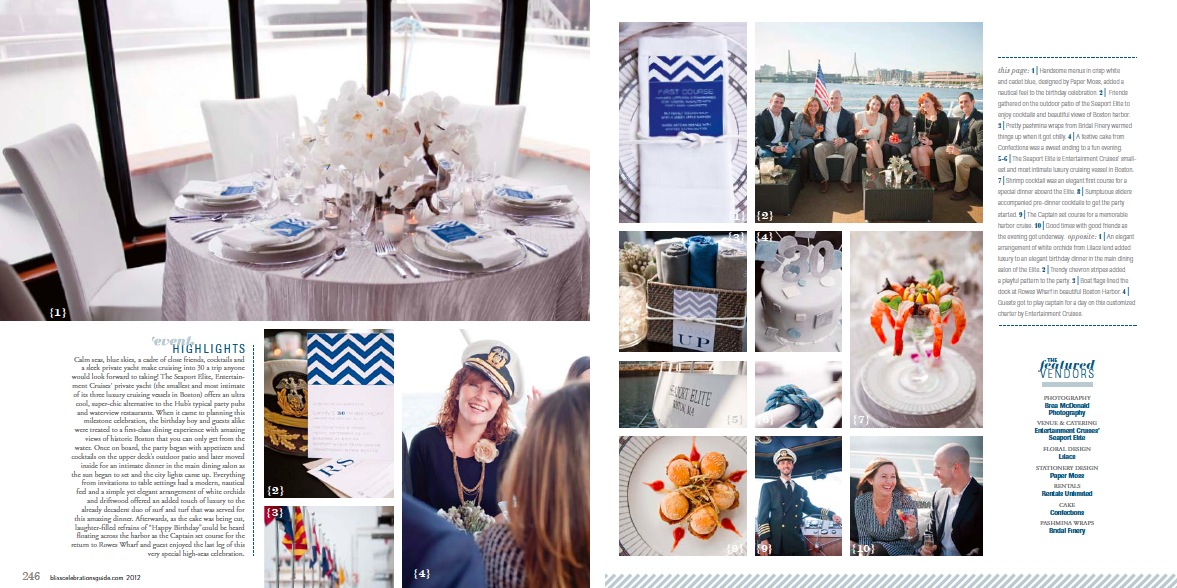
What could be better then the combination of nautical and chevron? This nautical excursion birthday celebration was beyond our wildest dreams and we were just thrilled to design the invitations, menus and detail signs.
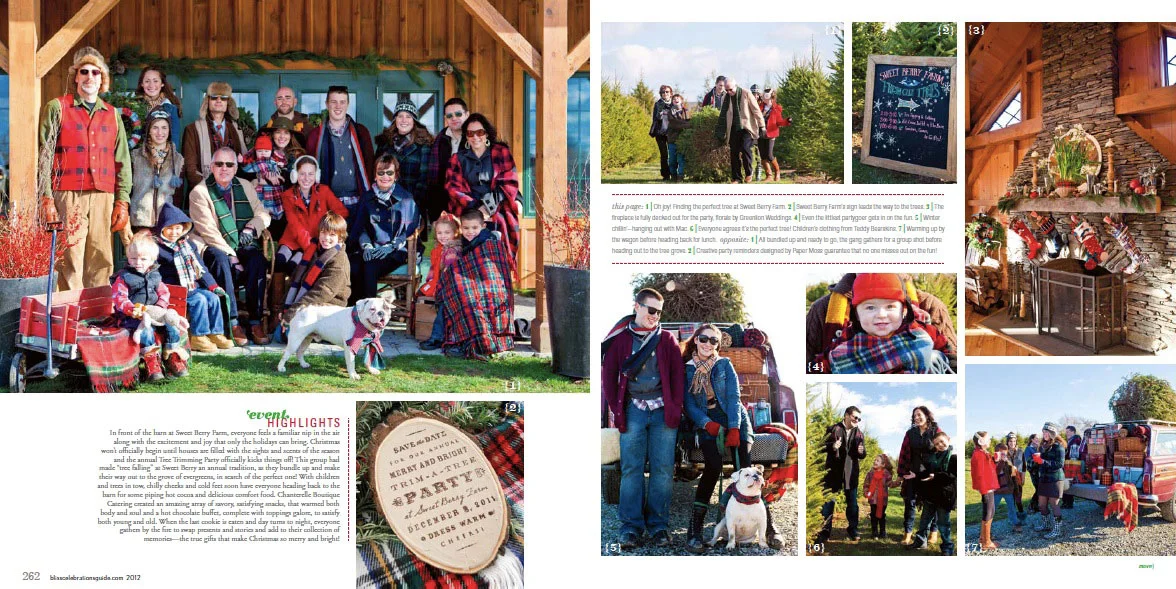
And last, we just love to print on mediums other then paper when we can... and this invitation to a tree trimming party is the perfect example!
Pure Bliss
Wednesday night, we had the pleasure of partying down at the launch of the new magazine Celebrations. With so many beautifully creative minds behind these pages, we knew it couldn't be anything less than perfect, but we had NO idea just how perfect it would be! Now that we have your attention, here are a few of the reasons why we are obsessing:
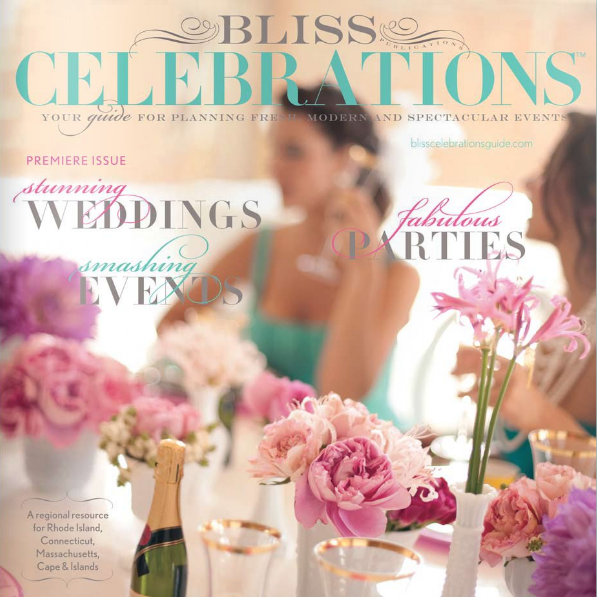
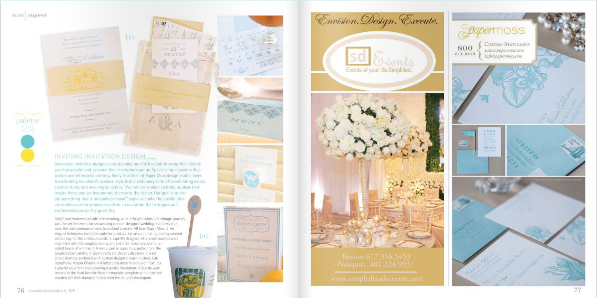
1. Abby & Will's letterpress invite was a perfect fit for one of their Color Board Features, all that which provide endless inspiration. {Did we mention the advertisements from vendors happen to adorably match each feature?} Love those details!
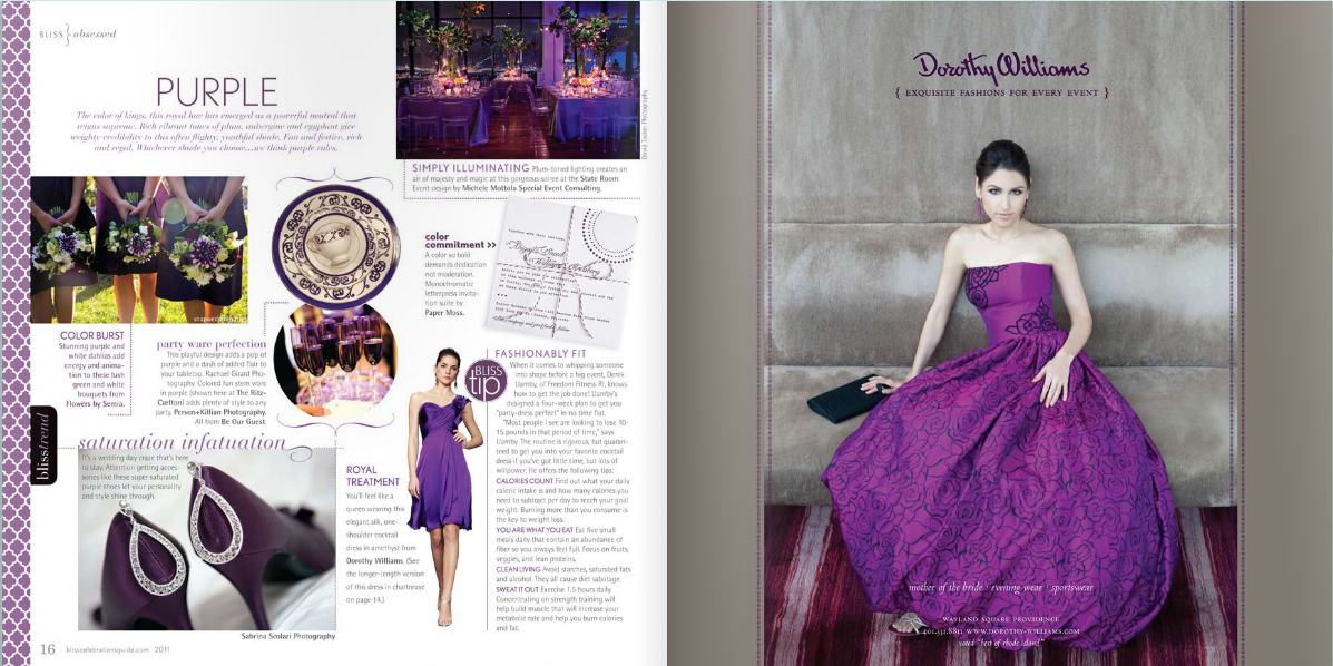
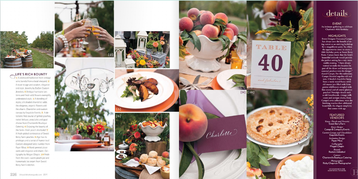
2. Inspiration shoots like THIS! Industry professionals collaborate to create breathtaking scenes filled with details that raise the bar. Whether it's a mitzvah, dinner party or wedding, there are stunning ideas flowing from page to page to page. We were thrilled to participate in this particular photo shoot at Sweet Berry Farm, alongside one of our favorite photographers Ricky from Public Image Photography.
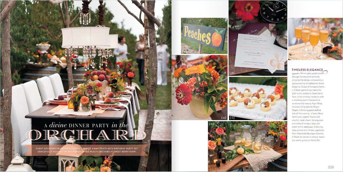
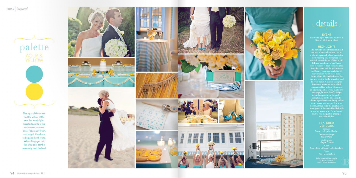
3. REAL events + color combinations that are to die for! Abby and Andrew's feature is just one of the many that we've been drooling over. ABSOLUTELY AMAZING. We continue to ooh & ahh over her TRUE Event details & flowers by Sayles Livingston, all captured by the lovely Leila Brewster Photography.
*Photos courtesy of Celebrations
