If you caught our post the other week about Bliss Celebrations Guide's color crushing, we're extra excited to share a "part 2" for the post. Within the beautiful pages of this magazine, are a few inspiration shoots that we had the joy of participating in! From Rustic Audubon to Vintage 1920's, get a load of these fun stationery suites that we designed!!


Featured: Bliss Celebrations
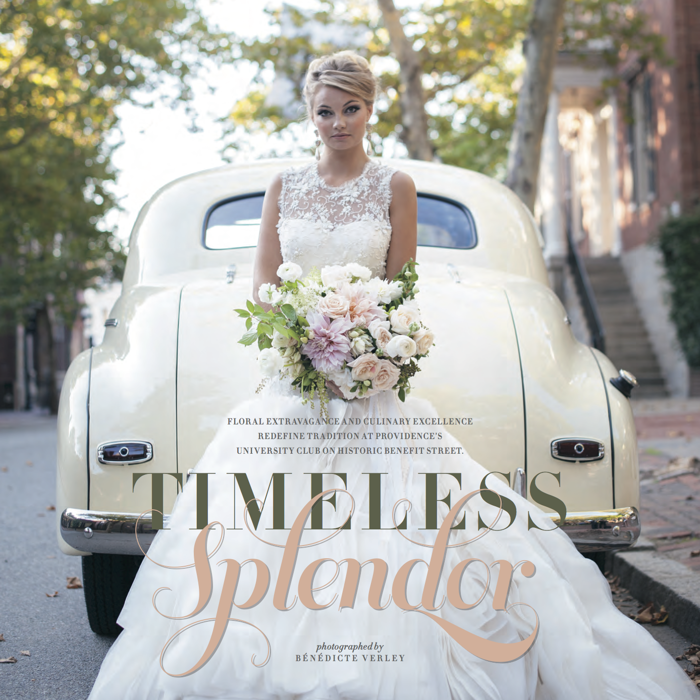
A couple of weeks ago, we donned our fanciest winter ensembles and headed over to the annual release party for the Bliss Celebrations Guide! As per usual, the event was over the top and impressive in every way. A perfect way to set the tone for their killer 2015 issue!! Along with some stunning real weddings and inspiration shoots galore, there was plenty of color crushing throughout the pages. Take a peek at some of the color trends for 2015... and some of our pretty stationery that was featured!!!

#9, Pia & Rob's marsala & gold wedding invitation.

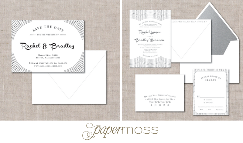
#3, Sarah & Devin's art deco inspired invitation suite.
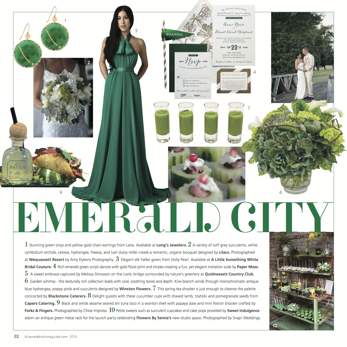
#4, Anna & Dan's rustic & modern invitation suite.
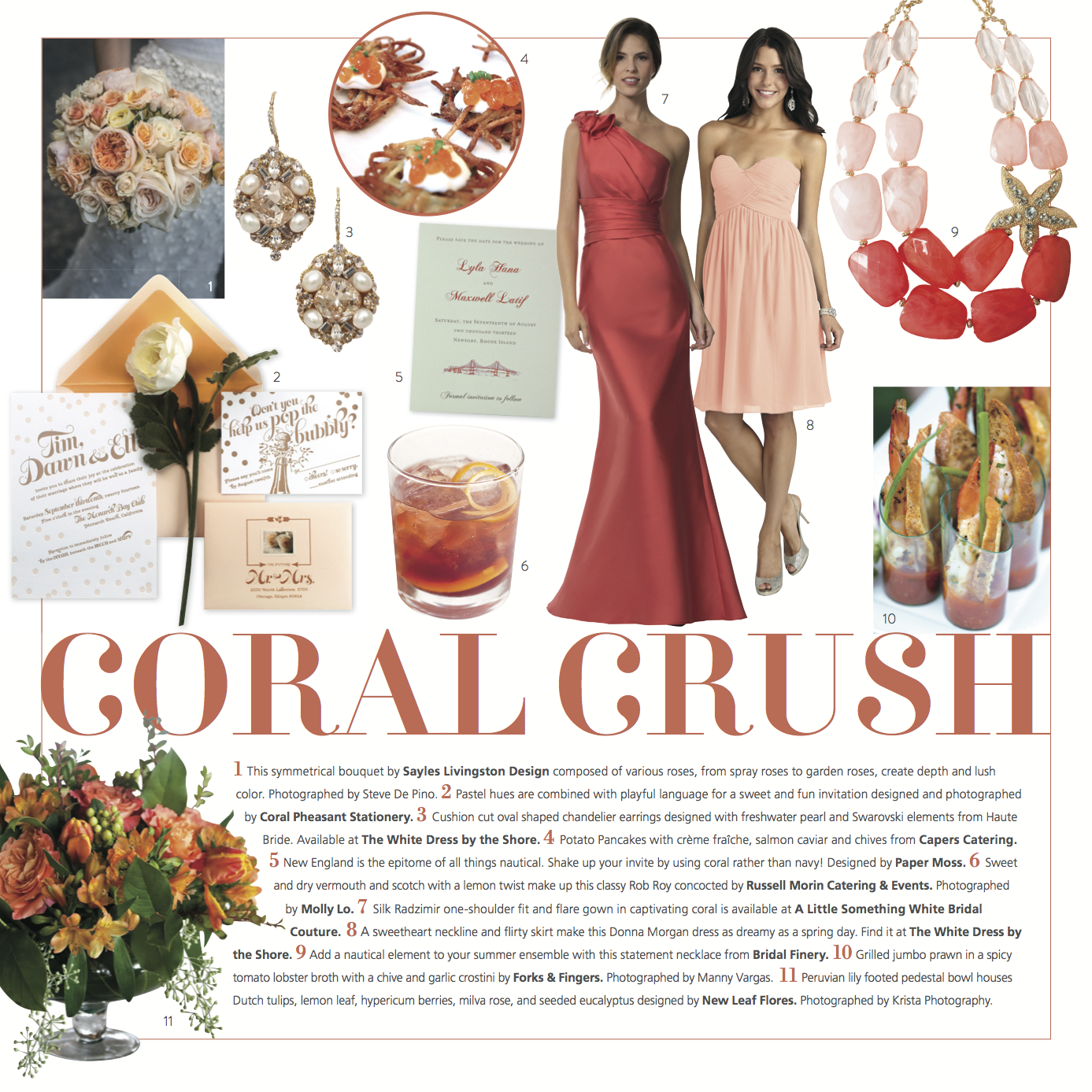
#5, Lyla & Max's Newport Bridge save the date.

#3, Kim & Dan's elegant black & white invitation suite.
Needless to say, we're pumped about these beautiful features!
Nautical Elegance At It's Best
It's the first official Monday of the spring season, so let's kick off the week with one of our latest nautical invitation suites! Everything about these designs makes us dream of warmer days & romantic beach-side weddings! What do you think of the navy ink & rose gold foil pairing?!

Photos courtesy of Erin McGinn Photography
Opening Night
Let's kick off this week by introducing another new design that we added to The Collection!!! Meet Opening Night...
These designs will look especially killer in letterpress printing... can you imagine the fun texture from all the little dot impressions?! Depending on which script font you choose, this design is versatile enough for a modern wedding, a retro style, an Indian fusion wedding and so on. The script font can take it in so many directions!
What do you think?!
Featured: Wedding Chicks!
One of our absolute favorite whimsical custom invitation suites was recently featured on Wedding Chicks' Happy Hour! We feel incredibly honored to have our stationery showcased among the other talented vendors & beautiful weddings on their blog!

Check out the post {here}!!
Painted Charm
With loads of whimsical inspiration, we designed Painted Charm. This new save the date set & matching invitation suite is part of our ready to order line, The Collection. We're super excited to finally bring it out in the open for all to see, in all of it's ethereal beauty!!
For those who don't know, all of the invitation suites in The Collection include a specialty paper envelope liner! We think this adds the perfect touch of elegance!

Due to the nature of printing, this design is only available in flat print. We'll be unveiling more new designs in the days to come!!!
Modern & elegant custom invitations
Happy Monday, friends! What fights the winter blues better than setting your sights on beautiful things and sparking creativity?! We've been swooning over these photos that Erin McGinn snapped of one of our custom invitation suites from last fall! Crisp navy, soft white and a touch of silver letterpress on a midnight blue RSVP envelope all work together make this suite pop. We love the mixing of fonts paired with unique frames and the subtle geometric & floral pattern!! What do you think??

Featured: Kristin & Rob
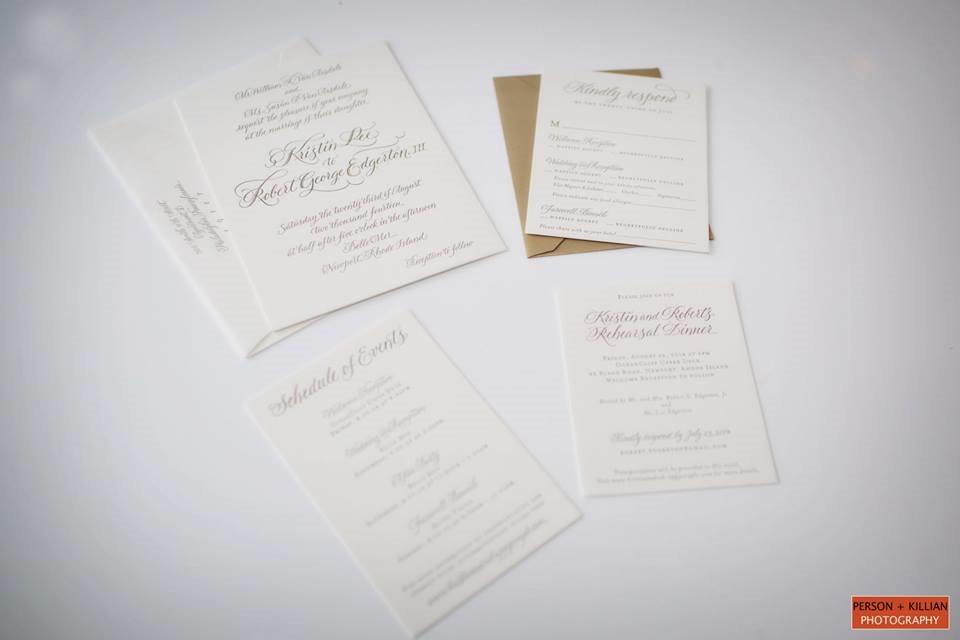
When it comes to picking a wedding palette, we think that you can't go wrong with sticking to neutrals and soft colors! Printing invitations in "soft gold" which has a subtle shimmer (gold foil is much more metallic & shiny) is one of our favorite routes to set the tone for an elegant wedding with a neutral palette.
Our clients, Kristin & Rob worked with Details with Love to absolutely nail their vision for a neutral palette & super romantic wedding at Belle Mer in Newport, RI. Leave it up to Person + Killian to perfectly capture every detail! We're thrilled that this wedding was recently featured on Carats and Cake! Check it out and get inspired!!

Here is a glimpse a Kristin & Rob's beautiful soft gold letterpress invitation suite!!
Featured: Ruffled Blog
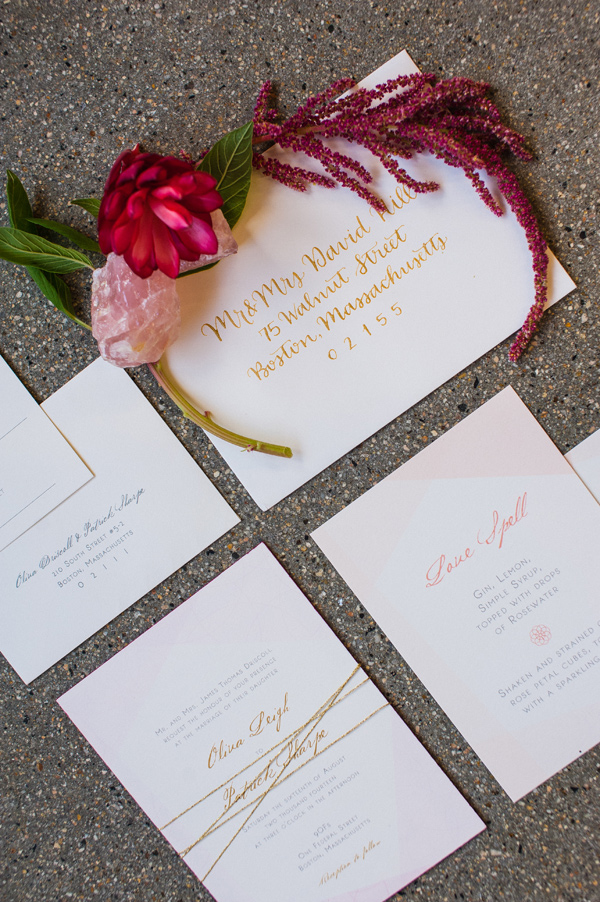
If you're a bride to be or if you simply enjoy pretty things, you've probably visited the Ruffled blog many times. I know we have!! We're thrilled that the talents behind this blog picked an inspiration shoot that we did a few months back! We had a blast collaborating with the gals at Whim Events to tie their vision for the shoot into some pretty paper goods! Shannon Grant of Rose Quartz Photography beautifully captured all of the pretty details and we've been in love ever since! Check out the whole soft & romantic shoot {here}… just in time for Valentines week!

Of course, we can't pass up the opportunity to share with you some of the stationery that we designed for the shoot! Enjoy!!!


Whimsical & Ready to Order!
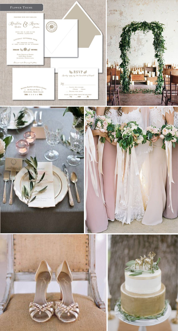
We had so much fun designing the Whimsical invitation suite for The Collection! We didn't stop with just one option for this design, but there are 4 little icon options within this style that change the look & feel altogether. This inspiration board plays off of our floral themed design. We think this suite is versatile, yet exudes rustic whimsy!!
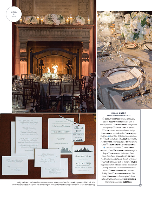
Featured: The Knot New England
Happy Friday, friends! We're super stoked to share a recent feature from The Knot Magazine's New England issue. We collaborated with the lovely ladies at True Event to bring Molly & Ned's gorgeous hand calligraphed, letterpress invitation suite to reality. The soft silver ink & silver painted edges added a touch of whimsy to a traditional suite. It's so fun to see how their wedding day came together- it's every bit as gorgeous as we could have imagined!! Photographer, Ned Jackson captured their day just perfectly. Take a look!!
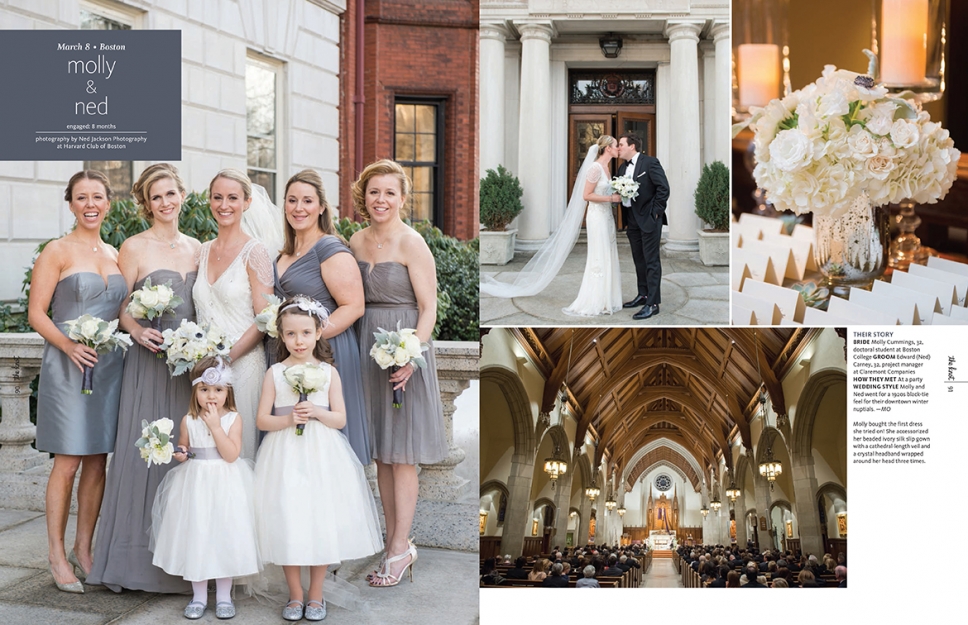
With Ned Jackson Photography capturing the whole thing
Featured: Engaged!
It's always fun to head into the weekend with some good news and a little bit of pretty inspiration! Today, we're excited to share that our stationery was featured in the most recent issue of Rhode Island's Engaged! magazine! We couldn't be more excited. Without further adieu, here is the inside scoop...


Mariel & Joe's mixed metallic letterpress suite is on the bottom, right side!

Cindy & Cris's purple floral suite is on the top, middle | Karen & Phillip's green garden suite is on the bottom, center

Laura & Chris' navy & white suite is on the top left | Emily & Charley's Save the Date is on the bottom left | Ashley & Fred's Save the Date is on the bottom, center

Erin & Christian's brown letterpress suite is on the bottom right
Thanks for sharing in our excitement! Have a fantastic weekend!!
The difference a font can make
We're still incredibly giddy about the recent release of The Collection, our new ready to order line! One of my favorite parts about the ordering process is how much designs can take on their own style based on the ink color and the script font choice. Have you seen our Formal Calligraphy suite?
This is my absolute favorite example of what a difference a font can make. Being able to choose from 48 different fonts {many of which were created from hand calligraphy} gives a plethora of different looks for this suite. For instance...
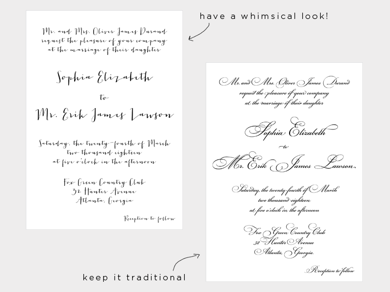
I'm holding my breath for the moment someone orders this suite letterpress printed in mint, light blue or sage ink!! Can you imagine the soft elegance?!
Featured: Boston Weddings
The recent issue of Boston Weddings Magazine highlighted some gorgeous floral inspired invitation suites, tastefully paired with arrangements. We're so flattered to have one of our custom letterpress suites included in the round up!! We're completely swooning over this partial barrel full of blooms designed by Blooms of Hope! It almost makes us wonder which came first- the invitation or the floral arrangement?! :)
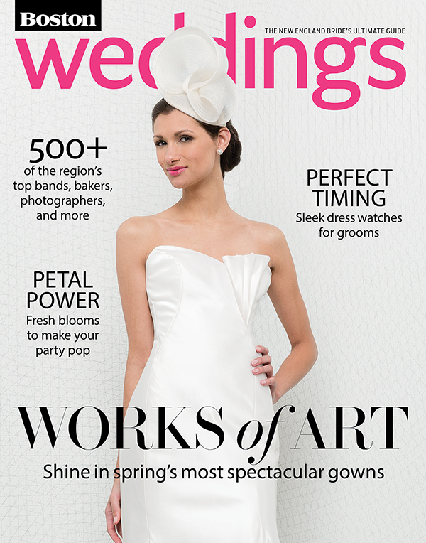

Check out the feature here and get ready to be inspired!!
Getting Vintage
We often meet with couples who want to have a unique & playful Save the Date. If you're not keen on going the card + envelope route, one of our all time favorite things is incorporating a vintage postcard, whether from the venue itself (if it's old enough) or from the city/ state that the wedding is taking place. Ali & Will's vintage Ocean House postcard Save the Date achieved the playful elegance they were aiming for! We popped these postcards in clear plastic mailer sleeves to protect against the weather and add a chic finish! What do you think?
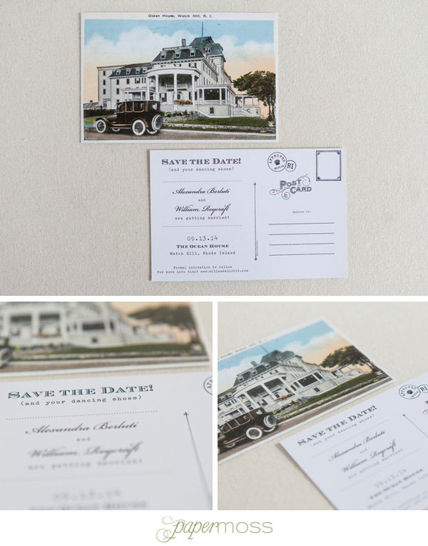
Photos courtesy of Erin McGinn Photography
Have a lovely weekend, friends!!
Modern mint + grey wedding
Today we're feeling inspired by clean lines, geometric shapes and this soft combination of mint & grey tones. Our new Modern Invitation Suite from The Collection is a perfect compliment to this chic & slightly whimsical look! What do you think?

Classic With a Twist
When it comes to wedding palettes, you can't go wrong with keeping a neutral palette- it's timeless! Inspired by the warm tones of blush, white, taupe and gold, we put together this board to showcase one of our new designs from The Collection. Our "Classic with a Twist" suite can be customized with wording, fonts, ink & envelope liner colors and printing method. We love how elegant & versatile it is!!

We're hooked
Happy Friday to you! Today we wanted to spotlight a little 2-color letterpress number that we designed for now newlyweds, Rachel & Colin. They wanted to set the tone for a laid back seaside wedding. We were charged to stay away from anchors, sail boats & ropes... while we love drawing inspiration from ALL of those, landing on their fish hook monogram was the perfect balance. We hope you enjoy!

Photo courtesy of Erin McGinn Photography
Watercolor Galore!
As a graphic designer working with computers and screens day after day, the one thing that I miss is using my hands to get dirty and create something tangible. Luckily, my longings for that creative outlet have recently been fulfilled. As of late, we have had some fun working with our clients to incorporate hand painted watercolor art. We have painted watercolor wash backgrounds, icons reading from vegetables to flowers, patterns, and even holiday themes!
We are so excited to continue to work these hand painted pieces of love into future designs with future clients.
Take a peek!

Retro Geometric Wedding Inspiration
Happy Monday, friends! We hope that you had a great weekend and a FABULOUS Thanksgiving! Can you believe that we're fully into the holiday season?! Hopefully you were able to get some relaxation in too… it's a slippery slope into holiday madness from here on out.
Let's take a minute to diverge from thinking about the holidays. For those of you who are planning weddings in 2015, we hope that you have taken a look though our new Ready to Order line, The Collection. We put together an inspiration board based on one of our new designs- Retro Geometric invitation suite {shown here with our clover liner} to get the wheels & inspiration turning!

Happy Monday!