When it comes to wedding palettes, you can't go wrong with keeping a neutral palette- it's timeless! Inspired by the warm tones of blush, white, taupe and gold, we put together this board to showcase one of our new designs from The Collection. Our "Classic with a Twist" suite can be customized with wording, fonts, ink & envelope liner colors and printing method. We love how elegant & versatile it is!!
Featured: Well Wed
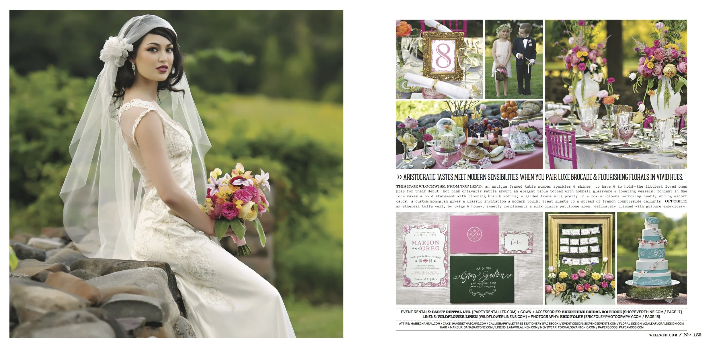
There have been a lot of exciting things happening around our office lately and we're excited to share one more today! The recent issue of Well Wed Magazine {Cape Cod & the Islands} featured a bright & punchy inspiration shoot that we collaborated with a dream team of wedding vendors on. We can't get enough of the bright colors, funky fonts and the beautiful merging of cultural influences that made this shoot SO MUCH FUN to work on. Take a peek at the pages for yourself but if you're local, we want to encourage you to pick up a hard copy of this mag- you won't be sorry!!
Thanks for the love, Well Wed!!!
Featured: Well Wed's No. 9
Hi friends! We hope your weekend was nothing short of FABULOUS! This week we're excited to kick things off with some pretty e-pages from one of our favorite magazines for wedding inspiration… Well Wed!!! We feel so blessed to have been featured a few times in their current issue and wanted to share it with you all! Enjoy and be inspired!!
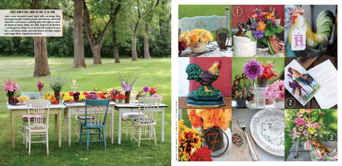
There's nothing we love more than designing little icons for clients and we recently had the chance to incorporate roosters on a Save the Date postcard as well as a couple of invitation suites, shown here in #2. Don't you love all of the bright florals and antique details on these pages?!
We're still totally swooning over Kyle Marie & Tom's subtly nautical invitation suite, shown here as #2 … paired with Well Wed's playful use of stripes & a garden elegance, we're OBSESSED!
And one last little pop of yellow, grey & white letterpress in Stephanie & Marco's invitation suite:
Thanks for being excited along with us! :)
Well Wed- spring & summer 2012
Well hello, Monday! Are we bummed you're here? NO. After having a fabulously relaxing weekend, we're just raring to jump back in to designs and meetings with clients. So why not start this week off with a wee bit of good news? We just caught wind that the spring & summer 2012 issue of Well Wed is out and low and behold, some of our stationery was featured!! You have to take a peek at the fun color palette inspiration they put together... and while you're at it, be sure to check out some of our fun accessories {pages 106 & 141} and invitations {pages 112, 132 & 142}. Thanks for sharing in this excitement with us and if you pick up the latest issue of Well Wed, you're guaranteed to be inspired with those wedding plans!!!
Well Wed
Happy Wednesday, lovelies!! We definitely did a celebration dance recently when we saw the latest issue of the Cape & the Islands edition of Well Wed Magazine. It's truly a beautiful issue packed full of AMAZING ideas and stunning inspiration!! One of the most exciting parts however, is having one of our recent inspiration shoots included!!! We worked with Tyra Bleek Photography, Becca of Petal Floral Design and the lovely ladies at Boston Bridal Lounge to bring this bright & beautiful "Winter Rainbow" concept to life.
Gorgeous, right?!! We're obsessing over this color palette! Another one of our fun invitation suites was included in the "Minty Fresh" inspiration board. Loving this cool & romantic combination!
These photos only scratch the surface... get your hands on an actual copy by ordering here! Thank you to Well Wed for showing us some LOVE!!! :)


