Pretty paper: Jennifer & Brian

From the very first meeting with Jennifer & Brian, we felt a click. They were aiming for a classic nautical color palette of navy blue and white and were in love with letterpress. Through using hand drawn icons, funky fonts and bold patterns their invitation suite evolved. Today, I'm excited to share this beauty with you all! Hope you enjoy & feel inspired!!

Happy Wedding Wednesday!

*All photos courtesy of Laura Ashbrook Photography

Pretty Paper: Kim & Dan

When it comes to setting the tone for a formal wedding, you can't go wrong with simple black paired with bright white. Kim & Dan fell in love with the idea of an "icon heavy" custom map Save the Date to introduce Newport, RI to their out of town guests. Sent in a black envelope with white calligraphy, it was elegant yet still a little playful!

We set the tone for their Belle Mer wedding by working with a hand calligrapher to write out the entire invitation. Incorporating icons, stripes and the blind impression of a rose throughout their royalty sized invitation gave way to some of the details that were to be seen for their wedding day:

What do you think of the diagonally written text?! I know it's not for everyone, but we're kind of loving it!!!

* All photos courtesy of Laura Ashbrook Photography

Stationery trends: painted edges!

When it comes to spotting trends we usually think in terms of fashion, but believe it or not there are stationery trends too! The beauty of custom design is trying new things and when there's something we've never done before, we love the challenge! One thing that Emily and I have been obsessing over for the past year is painted edges. This "add on" looks best when using double thick stock {so you can really see the punch} and it's exactly what it sounds like... we paint the edges of the paper with a bold, contrasting color. Seriously, few things get me psyched about stationery in the way that painted edges do. Here are some suites we've recently designed that showcase the awesomeness of PAINTED EDGES... enjoy!

Step up the elegance

Bring in a pop of color

 Add some polish to a simple style

Call us nerdy, but it was really fun to read about the process {here} and get the scoop from a printer's perspective. After years of adding these pops of color, it's fun to get a better understanding of the art!

Pretty Paper: Jenna + Dave

Happy Monday, friends!! What better way to start this beautiful week than with some pretty stationery?! This yellow & teal suite set the tone perfectly for Jenna & Dave's Castle Hill wedding. With a gorgeous outdoor ceremony and a garden inspired tented reception, it was a joy to carry these elegant letterpress designs all the way through to their day of accessories as well. I hope you enjoy the mix of florals, patterns and pops of colors as much as we did!!

*photos courtesy of Laura Ashbrook Photography

Monday updates

Hi friends! How was your weekend? I'm relieved to report that I survived the move into the new office and even started nesting a bit! So excited to share more details soon! That's just one of the exciting changes that's been happening around the Paper Moss office and TODAY, I'm excited to share another. :) Emily's hubby has been working his tail off and graduated with his MBA from Harvard over the weekend... what a rockstar! But something a little more relevant to you all, would be the little bump located at the bottom, center of this adorable pic:

If you didn't know, now you know... Emily is preggo! She's having a little boy and we {collectively} just couldn't be more excited! You may even be seeing some baby related posts in the weeks and months to come. :) And anyone who has fun baby shower ideas, please send them my way!!

Happy Monday!

Pretty Paper: Stephanie & Colm

On this Wedding Wednesday, I'm happy to share with you some fun, punchy stationery. First off, I want to say that the bride and groom {Stephanie & Colm} were an absolute kick to work with! Their fun and vibrant wedding vision was a perfect reflection of them... well, with a Lilly Pulitzer influence. Today for Wedding Wednesday, we wanted to share the pretty, preppy invitation suite that set the tone for a gorgeous, relaxed oceanside wedding. Hope you enjoy!!

*Photos courtesy of Laura Ashbrook Photography

Featured: Sree & Patrick

We thought it only fitting to start the week with {1} good news and {2} something absolutely stunning. So friends, get ready to swoon as you see more of this incredible wedding that was recently featured on Style Me Pretty's main page {the good news!!!}.

SP-SMP.jpg

We absolutely LOVED the vision of this wedding from the start and welcomed the challenge of setting the stage for two weddings- one Hindu ceremony and a Christian ceremony & reception the following day. Be sure to check out more of Sree & Patrick's chic, tropical inspiration!! But first, we couldn't resist sharing this lovely photo of their invitation suite shot by the fabulous 13:13 Photography!!

SP-invite.jpg

Happy Monday!

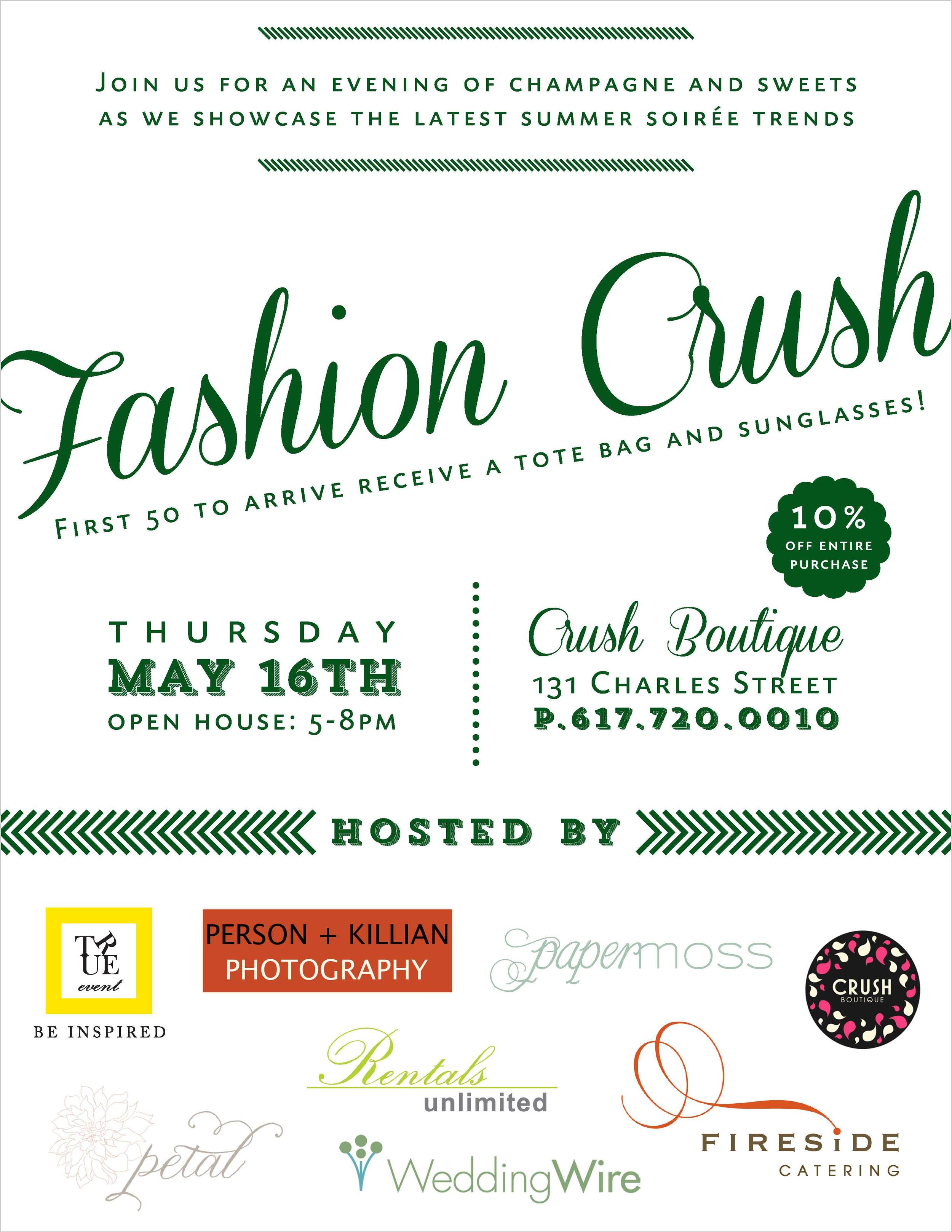
You're invited to Fashion Crush

We've joined forces with some other awesome local vendors for a super fun event next Thursday night {05.16.13} at Crush Boutique on Charles Street. Swing by during the open house to see some of the seasons hottest wedding trends- whether you'll be the bride or a guest! Grab the gals and enjoy some bubbly, some bites from Fireside Catering and a shopping discount at the boutique! Here are some more details...

Hope to see you all there!!

Pretty Paper: Betsy & Kevin

Betsy & Kevin came to us with visions of a casual and sentimental wedding at the Newport Yachting Club. This young couple who was full of life and ridiculously in love incorporated stripes, icons and a fun, non-traditional invitation layout in their two color suite. We completely love the pairing & contrast of peach and teal. If you're with us on that, pop back on Wednesday {for Wedding Wednesday} you'll see some more pretty inspiration with these colors!!

*All photos courtesy of Laura Ashbrook Photography

Love for Boston

We're taking a break from Tuesday Shoesday today to honor our city and ask for you to join us in prayer. For the family's of those who died... for all those who were wounded and those in critical condition... for those who were near... for those who saw things they so badly want to forget. Pray that justice would be served but that our hearts would not be hardened from this act of terror. Please pray that as a city we would know how to move forward, how to comfort those in anguish and how to forgive. For now, all we can do is pray.

{via}

Thank you all for your love and support!

xoxo

Pretty Paper: Marissa & Brian

We here at Paper Moss love a good challenge, especially when it comes to designing. When Marissa & Brian came to us with visions of a vintage and folk art inspired wedding, we instantly fell in love with the concept. Through working closely with Marissa and her event planner Sarah True, we brought it to life on paper and had a fabulous time carrying the designs through to details on the big day. For now, take a peek at their letterpress invitation suite!

But today's wedding inspiration doesn't stop there!! Just last week, the ladies at True Event shared a few pics from Marissa & Brian's wedding day. If you're digging their folk art & farm inspired style, check out their mini-feature! More photos to come... ;)

{via}

Happy Wedding Wednesday!

*Invitation suite photos courtesy of Laura Ashbrook Photography

Spotted on Martha Stewart!

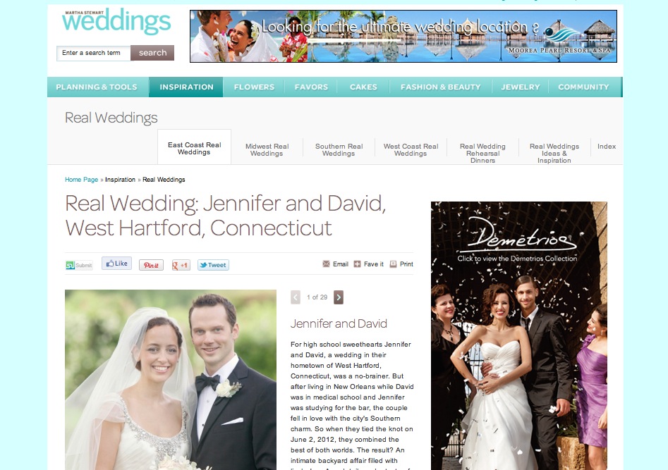
If you've been following us for any amount of time, you might know that Martha Stewart is one of our favorite people. For obvious reasons, right?! Well, today I'm happy {and honored} to share that some of our pretty paper made an appearance on Martha Stewart Weddings!! Jennifer and Dave's New Orleans inspired wedding was an infusion of southern flair {they both previously lived in New Orleans} combined with their New England roots. Together, they dreamt up one beautiful Connecticut wedding! Please join us in celebrating our Martha Stewart appearance and take a peek at these beautiful wedding pictures courtesy of Elisabeth Millay Photography!

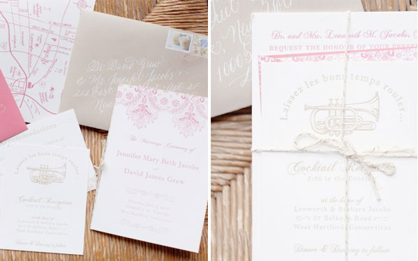
And of course, we couldn't resist sharing some of the stationery pics!!

 {via}

 Thanks for being excited with us!! Have a happy Monday!

The Knot: Pretty Purple

Just the other week, Emily and I were on our way back from a meeting and stopped into a little newsstand to check out the latest batch of wedding magazines. I'm so excited to share that we spotted one of our very own invitation suites in the latest issue of The Knot Boston and we just had to give you the update!

knot-cover.jpeg

We had heard that purple is making a comeback in weddings this year and this color report is convincing us that this is great news! Seriously, what a fresh and romantic round up AND you can pair purple with a variety of accent colors!

knot-SZ.jpeg

Thanks for sharing in our excitement! Happy Monday!!

Pretty Paper: Jennifer & David

I still remember my first meeting with Jennifer... absolutely loving both her personality and the wedding concept that her and David were dreaming up. They are such a sweet couple!! We paired golden and natural tones with a punch of strawberry to create this romantic suite. It was really important to Jennifer & David to reflect an essence of New Orleans in their stationery, since they had both spent time living there and would be having a New Orleans jazz band performing on the big day. Collectively, their invitation suite, day of accessories and their wedding as a whole was a perfect blend of New England elegance with some southern spunk!

Happy Wedding Wednesday!

Pretty Paper: Pia & Rob

When Pia and Rob came to us wanting to create a nontraditional invitation suite for their indian fusion weddings, we were elated at the challenge. With a series of events surrounding their Belle Mer wedding celebration, we took advantage of the opportunity to incorporate icons that complimented the elephant monogram seen throughout their big day. Aside from the specialty paper envelope liner, the gold foil, the patterns and playful text, my absolute favorite part was the texture of the RSVP envelope. Seriously, I wish everyone could have a sample of this paper... but because that's just not possible, I'll leave you with the fact that the line is called 'skin'. And that is how the unique texture of this rich crimson paper is best described. We hope to share more fun & unique details of Pia and Rob's wedding soon, but for now, take a peek at their suite...

*Photos courtesy of Laura Ashbrook Photography 

A little bit of paradise

Emily and I ended last week with a special site visit to the Ocean House in Westerly, RI. We were honored to be over night guests along with a handful of other wedding professionals including the ladies from True Event, Merci New YorkA.a.B Creates and Daughter of Design. Now let's preface this by admitting that we were huge fans of this venue to begin with, but after two days of soaking up the five star luxury first hand, we're flat out obsessed. So of course, we've got to give you the scoop about our time behind the doors of this iconic and breathtaking resort!!

Toni {their Sr. Catering Manager} hosted us and could not have been more welcoming, warm and professional. Our time started with a full tour to get acquainted with the property & amenities, including the restaurants, bars, the on site herb garden, work out facilities, lap pool, hearing about the array of activities offered seasonally & daily and touring the award winning OH! Spa {check out their relaxation room that over looks the ocean}...

We settled into a wine and cheese tasting with the Ocean House's own Food Forager {who was so sweet, knowledgeable and clearly passionate about her job} then finished our tour by taking in the INCREDIBLE views from the penthouse, various balconies and the side deck that over looks the ocean as well as the croquet court...

Post tour, we checked into our rooms and proceeded to gush about the cozy beds {with 400-thread-count Frette bed linens and 100% goose down pillows... OMG}, the huge soaking tub, the luxe robes, our fantastic view... and the complimentary treats just pushed us over the edge.

Our day finished with cocktails with the general manager and an incredible dinner with Toni and a special visit from Abby from Style Me Pretty. The service was impeccable, food was phenomenal and their house made wine {as well as their full selection} was to die for. 

Really, these few photos and brief overview can't begin to do justice to our experience. You really must go, if you're an east coaster... whether it's just for a day trip and dinner, a special celebration or a search for the perfect wedding venue!!

*all photos courtesy of the Ocean House
Pretty Paper: Marah & Dan

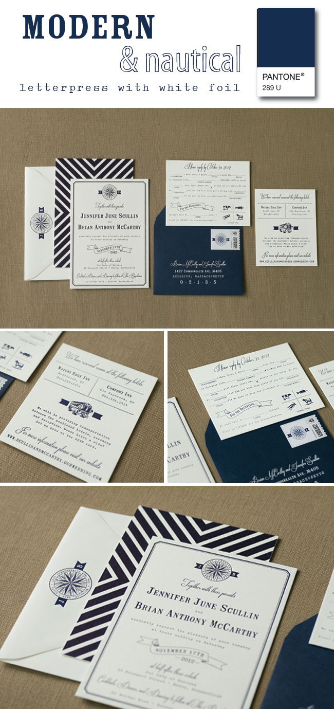
Today you're in for a treat. Yes, we're a little partial because we're nerdy when it comes to paper. In all seriousness, for Marah and Dan's invitations we got to play with some new fonts, funky borders, banners and patterns- and pull them all together in one beautiful suite. It was super fun to think outside the box with the layout of their invitation text too, using lines to highlight important info as opposed to the more traditional 'flourishes'. Top it off with colored envelopes and custom postage and you can see why we're still swooning... hope you enjoy this sassy suite too!!

Pretty Paper: Jordan & Geoff

Several months ago we were thrilled to feature the wedding of Jordan & Geoff and today we're even more psyched to share their letterpress invitation suite. We absolutely loved incorporating some modern elements {ie, the non-traditional layout of their invitation, a funky, slightly retro pattern throughout} and pulling in their super fun monogram on both their additional card as well as the outer envelope custom postage stamp. Hope you enjoy!!

*All photos courtesy of Laura Ashbrook Photography

Freshen up your color palette

We've been working on designing a super cute, subtly retro {yet elegant} Save the Date for a destination wedding this summer. It's been so fun looking at different color combinations to compliment the style, but this fresh monochromatic pairing landed on our favorites list.

So fun, isn't it?! You might have heard that mint is trending in weddings for 2013, so while dabbling in the freshness for their stationery design, we eagerly sought out inspiration in other areas to see how this hue is being used. Take a peek and let us know what you think...

{clockwise from top left: via/ via/ via/ via/ via/ via/ via}

Featured: Ally + Scott

Today we're psyched to share the beautiful wedding of some dear friends, Ally and Scott, that was recently featured on Style Me Pretty! Their Colorado mountain wedding was packed with rustic details and plenty of elegance... perfect to lend inspiration for those who are planning a fall or winter wedding! Check out the full feature here!

AS_SMP2.jpg

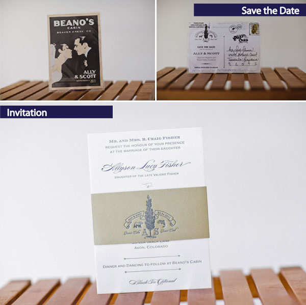
And we absolutely LOVED working with Ally & Scott to design their paper goods, and with that came a super cute & meaningful custom monogram. Their invitation suite appropriately set the stage for their big day...

AS1.jpg

Thank you to Dreamtime Images for sharing these beautiful photos & so perfectly capturing the wedding!!