Pretty Paper: Allison & Don

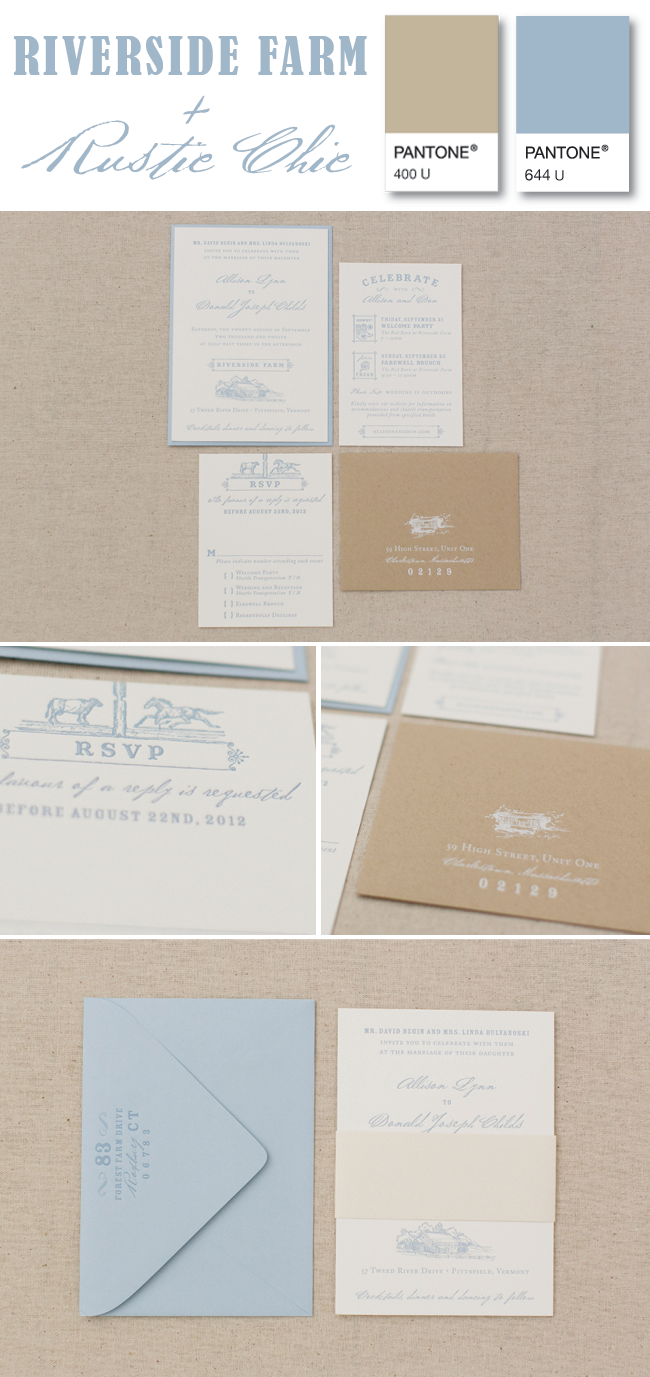
Hi friends! We hope you had a fabulous holiday weekend. Are you back at work ready to carpe diem?! Today we wanted to share some super rustic custom stationery to spark some inspiration. Not only are we obsessed with this color palette of smoky blue and natural, but the detailed sketches of the venueelements within it add so much character! If you haven't heard of Riverside Farm, you must check out this picturesque venue in Vermont. We think this 1-color letterpress suite set the tone just perfectly for Allison & Don's big day... but if you'd like to see for yourself, check out their feature on Style Me Pretty!

*photos are courtesy of Ruth Eileen Photography

Audubon style at its finest

Today, we're over the moon to share with you one of our all time favorite inspiration shoots, which was just featured on Style Me Pretty! We had the pleasure of collaborating with Greenlion Weddings, Glass Event PlanningRussell Morin Fine Cateringand the lovely Erin McGinn Photography to name a few of the talents behind this Vintage Audubon wedding styled shoot.
 

SMP-Audubon.jpg
PM-invite_2.jpg

With a charge to design an invitation suite and accompanying paper goods that exude Vintage Audubon style, we got to work and had a blast doing so!! We think that Kristen Henderson's hand calligraphy was the perfect touch on that chocolate brown envelope! :)

If you're pumped about how the invitation suite turned out, you'll definitely want to check out the rest of the feature & gallery here! But here's a little peek at the beauty to further entice you...

Audubon-feat.jpg

*all photos are courtesy of Erin McGinn Photography

Nautical Baby Shower Invites

It's hard to believe that over 10 months have passed since Emily welcomed her little guy into the world! That sweet little guy is definitely a charmer!! Today we're FINALLY sharing photos of the nautical baby shower invitation that we designed to celebrate his arrival!

Of course we couldn't deny this opportunity to share a photo of this little heartbreaker... isn't he the cutest?!

*stationery photos are courtesy of Ruth Eileen Photography

Monogram it!

Not everyone gets pumped up about monograms the way that we do, but when a bride knocks on our door in need of a one uniquely tailored to them, we JUMP at the chance! This is actually one of the things we love most about working with clients- designing a custom monogram that we can use throughout the invitation suite and incorporate into their wedding day materials. These little works of art vary in style and amount of detail included, depending on what each couple wants. Take a peek at some of our favorite monograms that we designed in the last few years, ranging from simple to complex... and from modern to rustic!

Which one is your favorite?

To learn more about general monogram etiquette, check out what our friends at Mark and Graham have to say {here}!

A lesson in typography

To say we love typography is an understatement. We at Paper Moss have been known to play "what's that font" on a day-to-day basis, with any random thing we see. Menus, signs, t-shirts... PRICE TAGS! Yea, it's a habit. Today we're nerding out and sharing some fonts that we're currently loving. So, take notes and perhaps next time we're in the same room you can beat us at our own, embarrassingly ridiculous game?! Or not... ;)

Seriously though, happy Friday!

From the Designer's Desk: National Stationery Show


1 | 2 | 3

I can't even begin to share the joy that I was filled with while attending the National Stationery Show in New York City this past weekend! It was a whirlwind of amazing color, paper, designs, and people!! Walking up and down the aisles meeting with new (and returning) print & design companies, paper vendors, and so much more, sparked the creative buzz in my head.

What I love most about the NSS is to be able to see how these amazing creatives have their own voice…and stick to it! There is nothing more beautiful then seeing the hard work of artists come out in their work. Just a couple of my favorite freebies from the show include two great frame worthy cards from Power and Light Press and Sycamore Street Press (who doesn't love a good copper foil?!?). And of course, luggage tags from Rifle Paper Co.

These artists, collaboratives, and business owners are truly inspiring to keep creating and stick to what I know and what I love. Passion and verve will always create the best stuff.


Until next time, from my desk to to yours!

xo

Caitlin


Pattern Mixology

When it comes to fun & modern stationery, there's nothing we love more than mixing complementary patterns. Well, aside from funky fonts & painted edges :) But this art of mixing patterns must be done carefully, otherwise it could be a total flop. Depending on what you're designing, some people recommend sticking to a 60/30/10 rule. That is 60% of a pattern you love, 30% a complimentary pattern and 10% an "accent" pattern. This rule definitely applies when thinking about home decor. Regardless of how you're mixing patterns, it's important to use patterns in a range of scales {they should vary in size} and include a variety- such as stripe variation, a midsize geometric, and a floral. We put together this little navy & white inspiration board with some fun patterns that we're currently LOVING, to give you a better idea:

mixedpatterns.png

via | via | via

Here's the pattern mixingin action on one of our favorite invitation suites:

001_Sree_Patrick.jpg

What do you think of the pattern mixing trend? Do you think it's better suited for home decor or stationery… or BOTH?

Whimsical Baby Shower Invitation

We hope that all of you moms & new moms felt every bit loved and celebrated on yesterday for Mother's Day! We've been welcoming a lot of little ones into the world lately. Between Emily having her little guy and other friends & family, it seems as if it's been non stop!! Today, I wanted to share a super sweet shower invitation that we designed a few months ago, to celebrate the birth of Emily's nephew. Between the little animal icons, the typography and the address stickers, I'm completely in love with this letterpress beauty...

*photos are courtesy of Laura Ashbrook Photography

Pretty Paper: Maggie & Josh

Getting married at a venue that is an iconic part of a city is something that should be played up, in our opinion. We were over the moon when Maggie & Josh came to us with their appreciation for art and subsequent vision of a formal wedding at the Museum of Fine Arts. By incorporating a hand drawn icon of the venue on the main invitation, along with a few smaller, complimentary icons for the schedule of events, their letterpress suite set the scene for a weekend of elegance and merriment!

Pretty Paper: Sabrina + Greg

One of our favorite colors for invitation suites is printing in a soft gold. This is perfect for a neutral color palate {champagne, blush, white, cream, etc} or even a palette that's still in the works! Soft gold ink allows the typography and designs to carry the formality- it's a win/win! Sabrina & Greg's invitation suite was created to set the tone for their black tie affair at Mount Hope Farm. While we're eagerly awaiting the feature of their stunning day to go live, I couldn't resist sharing their suite- complete with double thick cotton paper, a patterned backing on the invitation, a shimmery envelope liner and of course, custom postage!

*Photos courtesy of Laura Ashbrook Photography

Pretty Paper: Geordan & Rich

Geordan & Rich got married at Jonathan Edwards Winery in Connecticut and wanted their wedding to have a rustic, elegant feel. We set the tone for their big day by merging different patterns, textures and a mix of fonts to create a playful yet formal letterpress invitation suite. Top it off with calligraphy from the super talented Kristen Henderson, along with custom postage stamps and this suite has become one of our all time favorites!

*All photos are courtesy of Laura Ashbrook Photography 

Featured: The Knot

We've always loved the classic look of hand calligraphed invitations and are thrilled to see that this trend has been blossoming full force! The recent issue of The Knot magazine featured one of our invitation suites (#2) in their round up of calligraphy laden invitations.

Knot_1.png

Suite designs can range from all hand calligraphy like some of the samples shown to having only highlighted spots of calligraphy, depending on the style preference. There are increasingly more calligraphy fonts available these days too (such as our sample shown), so if hiring a hand calligrapher doesn't suit your time frame or budget, don't fret!

Knot_2.png

Pretty Paper: Molly & Thomas

Today I am over the moon, excited to share with you this particular Save the Date. We've been holding back this beauty for a really good reason... knowing the the wedding and stationery were going to be featured in Martha Stewart Weddings! Now that the issue is on stands (more details to come!!) is the perfect time to give you a peek at the pretty letterpress booklet that was sent to all guests so they could anticipate the fabulous wedding weekend that Molly & Thomas were planning. Enjoy this for now... and we'll share more about their full feature + invitation suite very soon!!

MollyThomas-STD.jpg

*photos courtesy of Laura Ashbrook Photography

Pretty Paper: Sree + Patrick

A few months back we had the joy of sharing with you Sree & Patrick's beautiful wedding that was featured on Style Me Pretty. Well, 1313 Photography did a stellar job of snapping some stationery photos for the feature, but today we're excited to show some more photos that get a little closer to the details and pretty letterpress of this beautiful invitation suite. Take a peek:

SreePatrick.jpg

*Photos shown are courtesy of Laura Ashbrook Photography

Pretty paper: Jennifer & Brian

From the very first meeting with Jennifer & Brian, we felt a click. They were aiming for a classic nautical color palette of navy blue and white and were in love with letterpress. Through using hand drawn icons, funky fonts and bold patterns their invitation suite evolved. Today, I'm excited to share this beauty with you all! Hope you enjoy & feel inspired!!

Happy Wedding Wednesday!

*All photos courtesy of Laura Ashbrook Photography