Nantucket v. Hamptons

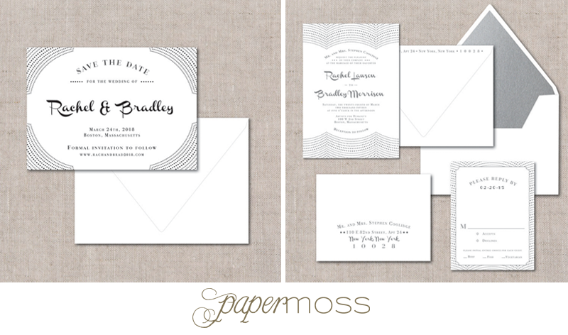
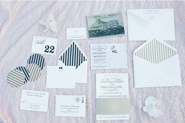
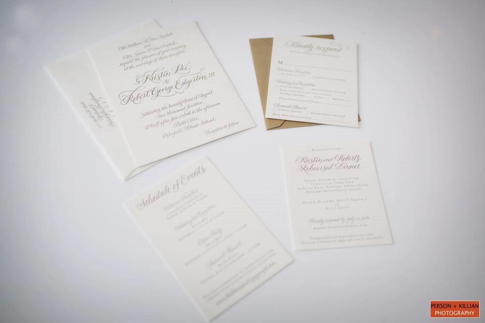
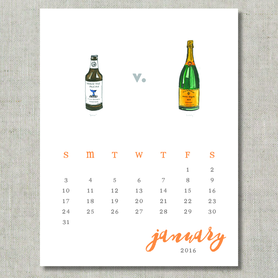
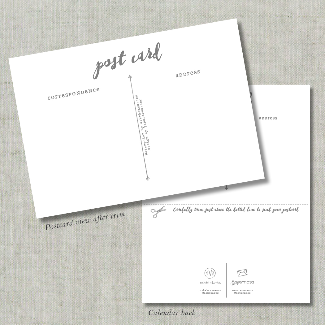
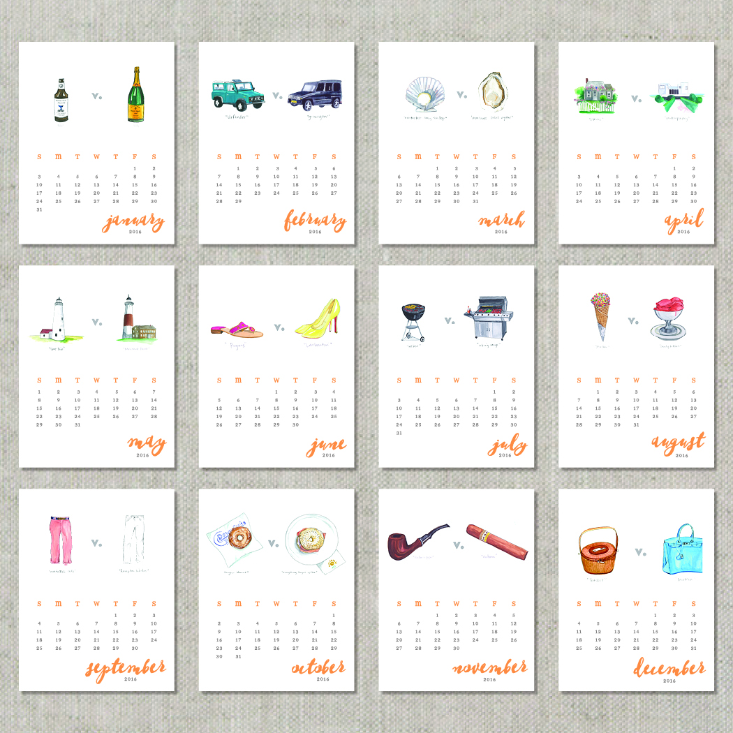
Well helloooooo friends! I assure you our blog hiatus was not for nothing... did you miss us? We have been keeping busy with designs, family & friends - all the while cooking up something fun for our fellow lovers of stationery (and summer). "Summer?" you ask? With the chill of winter and new year upon us, we are proud to announce our first ever 2016 "Lovers of Summer" Postcard Calendar. We teamed up with the uber-talented and creative duo over at ackvhamps.com in order to bring to life two of the most coveted vacation spots on the East Coast. Printed on luxe 130lb paper with an eggshell finish, each 5x6.5” month features a one-of-a-kind watercolor that turns into a 3.5x5" postcard. Because let's be honest, summer is a mindset so it only makes sense to keep it going year round. 

If you haven’t already, be sure to follow @ackvhamps on Instagram and see firsthand how they are all about showing off moments of summer for Nantucketers and Hamptonites alike. (They will make you want to book a summer trip to either location asap - trust us.) 

Ready. Set. SHOP and spread some summer. (Did we mention this might be the perfect holiday or hostess gift? Otherwise feel free to treat. yo. self. Just make sure you send a postcard to your Grammy.)

*Pre-order now until November 29th and receive a free 8.5x11" printable. All pre-orders will ship out second week of December. To ensure delivery prior to the Christmas holiday, place your order no later than December 8th. All orders include free USPS Priority shipping to anywhere in the US. Quantities are limited. Please reach out to us directly at info@papermoss.com if you'd like to place a large or special order. 

Happy Summer!


Hello beloved readers & followers! We have quite the year ahead of us and although we dearly love our weekly blog posts, we have decided to give as much of our attention & energy as possible to our current projects. This season is full of exciting & innovative designs that we can’t wait to share, so stay tuned. In the mean time, we wish you all a fabulous spring and summer!


xoxo
The Paper Moss Team 

Blissful Inspiration

If you caught our post the other week about Bliss Celebrations Guide's color crushing, we're extra excited to share a "part 2" for the post. Within the beautiful pages of this magazine, are a few inspiration shoots that we had the joy of participating in! From Rustic Audubon to Vintage 1920's, get a load of these fun stationery suites that we designed!!

Happy Easter

Easter is one of our absolute favorite holidays and we couldn't be more excited that it's coming up this weekend. After all of the festive candy we've been snacking on, it's about time to curb the chocolate intake!! ;) Wishing you a happy Easter, wherever and however you are celebrating!! 

Mosaic egg dying tutorial via Sugar & Charm

Mosaic egg dying tutorial via Sugar & Charm

Featured: Bliss Celebrations

A couple of weeks ago, we donned our fanciest winter ensembles and headed over to the annual release party for the Bliss Celebrations Guide! As per usual, the event was over the top and impressive in every way. A perfect way to set the tone for their killer 2015 issue!! Along with some stunning real weddings and inspiration shoots galore, there was plenty of color crushing throughout the pages. Take a peek at some of the color trends for 2015... and some of our pretty stationery that was featured!!! 

#9, Pia & Rob's marsala & gold wedding invitation.

#9, Pia & Rob's marsala & gold wedding invitation.

#3, Sarah & Devin's art deco inspired invitation suite.

#3, Sarah & Devin's art deco inspired invitation suite.

#4, Anna & Dan's rustic & modern invitation suite.

#4, Anna & Dan's rustic & modern invitation suite.

#5, Lyla & Max's Newport Bridge save the date.

#5, Lyla & Max's Newport Bridge save the date.

#3, Kim & Dan's elegant black & white invitation suite.

#3, Kim & Dan's elegant black & white invitation suite.

Needless to say, we're pumped about these beautiful features!

Nautical Elegance At It's Best

It's the first official Monday of the spring season, so let's kick off the week with one of our latest nautical invitation suites! Everything about these designs makes us dream of warmer days & romantic beach-side weddings! What do you think of the navy ink & rose gold foil pairing?!

Photos courtesy of Erin McGinn Photography

Photos courtesy of Erin McGinn Photography

The Little Things

In our peak season of weddings, it's the little things that we look forward to most. Getting a manicure after weeks and weeks of dodging paper cuts from sorting through pretty paper... sleeping in on a Saturday... cuddling up with coffee & a book... going for a walk that is NOT to the office... having time to bake something comforting?! ;) You get my drift. I'm sure you have your own list of "little things". This weekend, I'm committed to making some of these happen. 

via

What's on your list?

Spring Green

Maybe it's because St. Patricks day was yesterday or perhaps it's the fact that we can't seem to get over 2013's Pantone of the year, but we're LOVING all things green. A range of green tones for a wedding palette is quickly becoming one of our fresh new faves. Playing up greens in the floral department is also a huge trend right now... garland draped down the center of long tables, adding more greenery to bouquets, boutonnieres, etc. This palette paired with white and hints of gold is a super elegant look! 

via | via | via

via | via | via

Opening Night

Let's kick off this week by introducing another new design that we added to The Collection!!! Meet Opening Night... 

These designs will look especially killer in letterpress printing... can you imagine the fun texture from all the little dot impressions?! Depending on which script font you choose, this design is versatile enough for a modern wedding, a retro style, an Indian fusion wedding and so on. The script font can take it in so many directions! 

What do you think?!

Vintage Lift Tickets

The weekend is here!! Do you have any fun plans yet? Confession- I've been counting down the days until this weekend... probably for the last month. My man and I are meeting some friends in Colorado for a ski weekend. Not only have I never been to Colorado {Emily's homeland} but I haven't skied anywhere other than New England! I'm excited to hit the slopes and take in the beautiful surroundings. 

In anticipation, I wanted to share some escort cards that we designed for a Vermont wedding this past winter...

It's all in the details, friends, and we can't get enough of these little vintage lift tickets! 

Have a wonderful weekend!! 

Patiently Waiting

Happy Monday, friends! Over the weekend, we met with a bride who was pulling invitation inspiration from her wedding day florals. It got our minds spinning and thinking of all of the beautiful blooms that are currently beneath the dirty piles of snow in Boston, just waiting to break out for spring. Until then, we look to our favorite wedding blogs & Pinterest for inspiration. Isn't this bunch of florals just stunning?!

via

Painted Charm

With loads of whimsical inspiration, we designed Painted Charm. This new save the date set & matching invitation suite is part of our ready to order line, The Collection. We're super excited to finally bring it out in the open for all to see, in all of it's ethereal beauty!! 

For those who don't know, all of the invitation suites in The Collection include a specialty paper envelope liner! We think this adds the perfect touch of elegance!

Due to the nature of printing, this design is only available in flat print. We'll be unveiling more new designs in the days to come!!!

Featured: Sarah & Mike

We've been obsessed with the wedding blog Carats & Cake lately! Full of inspiration, they feature stunning real weddings and highlight the vendors that brought the big day into fruition. If you're searching for wedding vendors, this is a great place to see some of their work… and get inspired! 

We're super excited that Carats & Cake recently featured Sarah & Mike's Ocean House wedding!! We loved working with True Event, and this incredibly sweet couple to tackle designing all of their stationery, from save the dates to welcome tote bags & everything in between! Check out the full post of their photos, all taken by Leila Brewster Photography.


We've got emerald on the mind

Let's not put it lightly- we're in love with emerald. There are so many tints, shades and tones of this hue and they all convey an elegant, serene vibe... don't you agree?

Well, we have been working on the most elegant custom invitation suite lately, and it's being printed in a dark emerald letterpress ink. We couldn't be more excited. There are so many other gorgeous details for this invitation suite, but during the process of sourcing inspiration, we stumbled upon this beautiful photo of a perfectly placed emerald stone. Be still our beating hearts!!!

This engagement ring is striking! What do you think? Would you ever consider having an engagement ring like this?

Winter Whimsy

All this cold weather is more than getting to us. It's been one long winter!! Despite that, we're still finding {and LOVING} lots of cozy wedding inspiration for those of you who are planning winter weddings. Here's our latest round-up of colorful, whimsical hues that are sure to look striking against a chilly backdrop!

winterwhimsy

Modern & elegant custom invitations

Happy Monday, friends! What fights the winter blues better than setting your sights on beautiful things and sparking creativity?! We've been swooning over these photos that Erin McGinn snapped of one of our custom invitation suites from last fall! Crisp navy, soft white and a touch of silver letterpress on a midnight blue RSVP envelope all work together make this suite pop. We love the mixing of fonts paired with unique frames and the subtle geometric & floral pattern!! What do you think??

Featured: Kristin & Rob

When it comes to picking a wedding palette, we think that you can't go wrong with sticking to neutrals and soft colors! Printing invitations in "soft gold" which has a subtle shimmer (gold foil is much more metallic & shiny) is one of our favorite routes to set the tone for an elegant wedding with a neutral palette.

Our clients, Kristin & Rob worked with Details with Love to absolutely nail their vision for a neutral palette & super romantic wedding at Belle Mer in Newport, RI. Leave it up to Person + Killian to perfectly capture every detail! We're thrilled that this wedding was recently featured on Carats and Cake! Check it out and get inspired!!

Here is a glimpse a Kristin & Rob's beautiful soft gold letterpress invitation suite!! 

k&rob PM invite